We’re excited to share announcements about two big updates we launched in the last month to make filtering cohorts more powerful in Everhort.
First Purchase Filters
Customers like using Everhort’s order filtering tools to analyze cohort performance based on certain criteria about the customer’s purchase, such as a specific product they purchased, or a property on the order.
Up until now, those filters would always match customers having any order that matched the filter. A new feature we launched last week now gives you more control over which of a customer’s orders have to match:
Expanding the new dropdown gives you the following options:
Selecting “Their first purchase” will restrict the filter to only those customers making the indicated purchase on their first order (if they made the purchase again later, that’s ok). Selecting “A subsequent purchase” will restrict the filter to only those customers making the indicated purchase on an order placed after their initial purchase (if they made the purchase on their first purchase also, that’s ok).
Collection Filters
Many eCommerce sites offer collections (or categories) to organize and present their products to customers.
We’ve recently added a new option to filter by collection when viewing reports in Everhort. This filtering option is available in your account if you’ve connected your store using our automatic Shopify data import tool.
To filter by collection, select “Collection” from the dropdown on the “Order” tab:
Like the other order-level filters, collection filters also work in conjunction with the “first purchase” filters described above, so that you could, for example, filter cohorts by customers who made their first purchase from a given collection:
Sometimes when you’re forecasting LTV, you want to see how projections based on recent performance compare to projections based on longer time periods.
Up until now, Everhort’s LTV forecasts were always based on a linear projection of the blended average performance of the last 12 monthly cohorts. There were reasons for this. If customer retention rate drops off after 6 months, you typically want to factor that into your forecast. But if average order value has been increasing recently, you want to account for that as well. A trailing one year period strikes a good balance between considering enough historical context to know how customers engage with the business over time, while still incorporating recent data, which is why it’s still the default time period for LTV forecasts in Everhort.
But sometimes your business changes significantly. Maybe you’ve been experimenting with new offers or eCommerce subscriptions. You’ve seen big changes and you’re curious how that could impact future LTV if recent trends continue. For this reason, we’ve recently enhanced Everhort’s LTV forecast tool to tailor its projections to the currently selected time period:
You can see from the example above that the one year forecast based off the trailing 6 months of cohort performance is $1,943, compared to $1,276 when using the last 12 months of cohort performance.
One last thing to note: When a shorter historical time period is selected, Everhort will also shorten the time period used in its forecast.
We believe having the flexibility to compare forecasts based on different historical time periods will help you get a better sense of what you can expect LTV to look like in the future.
Everhort’s interactive Stacked Activity chart is a great way to see how cohorts acquired within a given time period stack up and contribute to overall revenue during that period. It’s easy to see at a glance whether you’re getting significant contributions from multiple cohorts, or if you’re relying too much on new customers.
One piece of the picture had been missing from this chart, though. It wasn’t easy to see how the contributions from cohorts acquired during the chosen time period compared with those acquired before that time period.
With the introduction of a new layer in the chart, we’ve filled in this missing piece:
This new layer, which can be toggled on or off, represents the rolled up contributions of all cohorts acquired before the start of the selected period. As with the other layers, you can view these contributions in terms of revenue or number of returning customers, and you can click to isolate this group:
Good businesses know it’s important to get contributions from all customers, and we think this improvement to our stacked cohort activity chart makes it easier to see the whole picture.
We’ve recently added some new tools that work really well together to help you better understand customer behavior. These tools are available in your account now if you’ve connected your store using our automatic Shopify data import tool.
New Filtering Options
We’ve added two new ways for you to isolate different segments of customers for analysis in Everhort.
Customer Tags
When you click to add a filter, you’ll now see a dialog like the one below, with tabs to select filters at the customer level or the order level.
On the customer tab, you can now select to filter by customer tag. Tags will be populated automatically from your store if you are using Everhort’s Shopify import connection.
Order Properties
If you click over to the “Order” tab, you can filter customers based on certain criteria about their orders. On this tab, we’ve added the ability to filter by product property:
Like customer tags, product properties will be imported automatically from your Shopify store.
You can use several different types of matchers when filtering by product property, including Equals, Does Not Equal, Is Set, and Is Not Set. You can learn more about how these matchers work can in our support center.
New Baseline Average LTV
After applying a filter, Everhort will add a new green line to the LTV by Cohort chart showing how the “baseline,” or unfiltered average LTV compares to the performance of your filtered customer group.
For example, let’s say we’ve filtered by customers who are tagged “Subscriber:”
The new “12 mo. average (baseline)” curve helps us see that all monthly cohorts in the “Subscribers” segment of customers, especially recent cohorts, have superior LTV curves. After 11 months, customers in this segment have an average LTV of $2,000, compared to an average LTV of only $1,226 among the customer base as a whole.
We believe the new filters and baseline average tool work well together to help you understand how different segments of customers perform relative to each other. We will be adding more types of filters and matchers in the future to allow you take this even further.
In The Lean Startup, Eric Ries calls cohort-based reports “the gold standard of learning metrics.”
Let’s explore why the creator of a system that has attracted thousands of adherents around the world places so much value on cohort analysis.
Removing Uncertainty
According to The Lean Startup, in the early stages there is little that founders can say they know for sure about their business. They have an idea for a new product that they think people will pay for. But they don’t know that people will value it, or which types of people will value it, which aspects of it they will value, or whether they’ll value it enough to pay for it. A startup’s early days are full of uncertainty and untested assumptions. And because every startup has a limited amount of time before it must either turn a profit or die trying, The Lean Startup philosophy believes that startups must be finely-tuned learning machines dedicated to testing those assumptions continuously.
In The Lean Startup world, the goal of every iteration of work should be to design and execute a test that confirms or rejects a hypothesis as quickly as possible. This is called the Build-Measure-Learn loop.
Building
Almost all startups are good at building things. Unfortunately, this can be their downfall. It’s easy for startups to fall into the trap of believing that if they just continue to iterate on the product, eventually paying customers will come flooding in. Some put all of their attention on the Build step, and don’t even consistently measure anything at all.
Measuring
Most startups avoid that mistake and are also good at collecting data and generating metrics. There are plenty of analytics tools that will generate a snippet of code that developers can plug into the product, and–Presto!–you’re measuring things. A dashboard of colorful charts and tables is produced every day providing a multitude of stats about the business.
All too often, however, this is where startups who don’t follow the Lean philosophy make a key mistake. They fall victim to tracking what The Lean Startup calls Vanity Metrics: aggregate numbers like total visits, page views, registrations, events, etc. that tend to increase over time and give the impression that the business is succeeding even if it really isn’t. With the numbers going up and to the right📈, it’s easy to justify each additional iteration of engineering and delude yourself into believing that success is just around the corner.
Tracking vanity metrics breaks the Learn portion of the Build-Measure-Learn loop. With a broken Learn step, startups never reject any of their assumptions. When they ship things customers don’t care about–wasting precious time and energy that could be used building something customers would care about–they don’t realize it. The aggregate metrics they’re tracking mask the impact of their work. If a dip in numbers does occur, it is easily attributed to something other than the startup’s hard work. (Or worse yet, internal groups will each blame each other.) The startup will go into the next Build iteration without any new knowledge or insight about how the product is working for customers.
Learning
In order to have a properly working Learn step, you must gather and analyze actionable and accessible metrics:
Actionable metrics: show a clear cause-and-effect relationship between things the startup is doing and things customers are doing as a result.
Accessible metrics: are simple enough to be understood by the entire organization.
Cohort-based reports check both of these boxes.
Actionable
Cohort-based reports measure the key actions that specific groups of customers perform over time. One of the most useful ways of grouping customers is by the week or month that they were acquired. This provides a natural way to track their key actions over time and compare them to other cohorts acquired earlier or later.
Here’s an example cohort analysis for a hypothetical startup whose key customer actions are signing up, saving a profile, and making a purchase:
Rather than showing aggregate values, this graph shows the rates at which new customers who signed up in each month completed the key actions. We can see that the rate at which new customers complete profiles is increasing at about 3% per month, but this increase is not translating to more purchases.
When combined with split-testing (aka A/B testing), which Lean startups also love, cohort-based reports can even compare how a group of people receiving a specific product enhancement within a cohort performs against those not receiving the change. This helps further isolate against other factors such as seasonality of the business or changes to sales or marketing campaigns.
Accessible
Today there are more analytics packages than ever before, and each one is racing every day to add more widgets, panels and dashboards. But just because you have more data does not mean you have more insight. It’s easy to get overwhelmed by the sheer number of reports, or to even not understand the meaning of the metrics being presented to you. The definitions around the things a report is tracking can be hard to keep straight.
Cohort-based reports are easy for everyone in the organization to understand because they report on a metric we can all identify with: people.
Each chart reflects the actions that a real person or group of real people took with your product. Everyone in the company should not only be able to identify with that, but tracking and improving the rate at which people move through your application should get them excited, because it directly translates to more engaged and successful customers.
Wrapping Up
Lean startups worship Cohort-based reports because they provide a highly effective way to test hypotheses about the business, learn what’s working and what’s not, and translate that learning into course corrections on the path to sustainable growth.
When you first start digging into how cohort analysis can help you learn about the health of your business, you’ll typically encounter a lot of triangle-shaped retention charts that look like this:
Orienting yourself to these charts can take a minute, even if you’ve done it before. What do all these numbers mean? What’s with the colors? And why is it triangle-shaped?
These charts tabulate the percentage of customers who return each period after their first purchase and make a repeat purchase. Each row represents a cohort of customers acquired during a given period (usually a week or a month), which is listed in the first column. Cohorts are ordered from oldest to newest moving down. As you move to the right along a row, each column shows how many customers from that cohort returned or made a repeat purchase in each subsequent period. Older cohorts have more periods of possible retention than newer ones, which is why each row is shorter by one column than the row above it, producing the triangle shape. As for the colors, typically these charts will highlight cells above a given retention percentage in green, cells below a certain percentage in red, and those in between in yellow.
Once you’ve familiarized (or re-familiarized) yourself with the structure of these charts, you’re faced with another, more challenging question: how do you make sense of the data? Should you read it top down? Left to right? Diagonally? As humans, we have a natural tendency to see patterns in data, and your eye is probably drawn to multiple patterns in the above chart. Are those patterns significant, or are they just noise? What do they mean? How is my business actually doing?
Retention charts are confusing and overwhelming. There’s a better, more intuitive way to understand the health of your business.
Lifetime Value by Cohort
Customer lifetime value (LTV or CLV) is the single best metric for understanding the health of a business. If average order value goes up, lifetime value goes up. If margins improve, lifetime value improves. If customer retention improves, lifetime value improves. The opposite is also true. If order value, margin, or retention drop off, customer lifetime value is also going to suffer. LTV should be your go-to metric for the simple reason that it reflects the aggregate impact of many of the underlying drivers of profitability.
If we view LTV through the lens of cohorts grouped by acquisition date, we can open up another important dimension of understanding: how things are changing in the business over time.
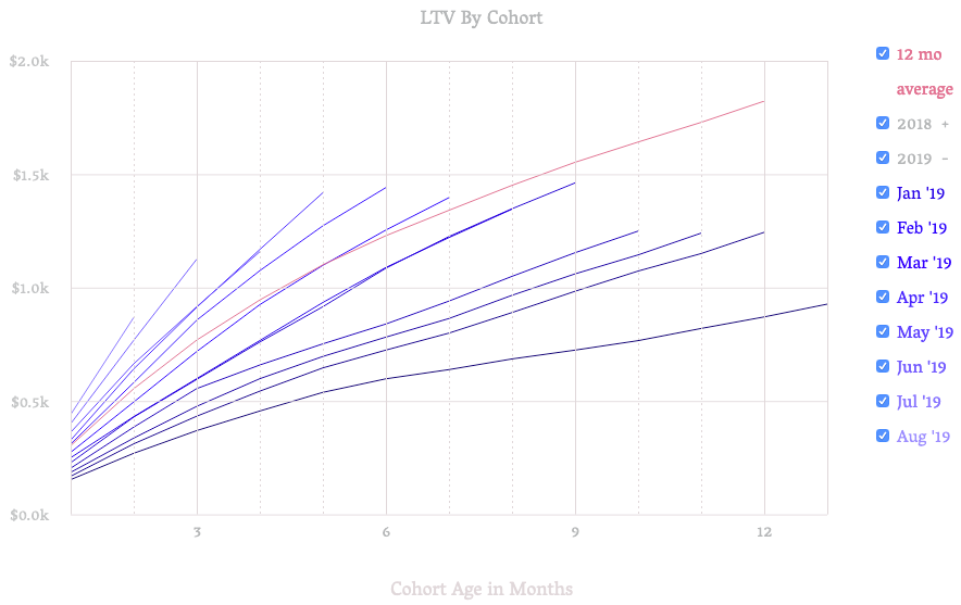
Let’s see how this works by looking at an example LTV by Cohort graph exported from Everhort for a fictitious company:
Orienting yourself to this chart is easy. Each line shows the cumulative average lifetime value of a cohort over time. The longer (and darker) the line, the older the cohort. The Y-intercept, month 1 for all cohorts, shows the average value of their first order. From this chart we can see that first order value has been increasing steadily on average over the last 12 months, because the shorter, lighter lines have higher Y-intercept values than the longer, darker lines.
By comparing the shape and slope of each line, we can understand how much value each cohort contributes to the business over time. Lines that increase more sharply provide more value more quickly. In the chart above, we can see that recent cohorts have steeper slopes than older cohorts. This means the business is improving at recognizing more value in less time.
Here’s an example of a different fictitious company:
Like the previous company, this company is steadily increasing average first order value, as the Y-intercepts are rising for shorter, younger cohorts. Unlike the previous company, however, this company’s cohorts quickly flatten out after about 6 months. Flattening cohorts are a warning sign in these graphs. It means customers in the cohort have virtually stopped engaging and are no longer producing value.
LTV by Cohort charts help us quickly answer important questions like:
How long do newly acquired customers engage and generate value for our business ?
How does the rate of engagement of new customers compare to older ones?
Is the business improving the rate at which it generates profit from customers over time?
Answering these question can help confirm if tactics being worked on to improve underlying drivers of LTV are working or not, or what areas might need to be investigated further.